The Town of Knightdale is one of the fastest growing municipalities in North Carolina. Over the last few years, our town has transformed from a small crossroads in eastern Wake County into a vibrant, young and energetic community, while keeping our small-town charm. With easily accessible amenities throughout Knightdale and the Triangle, continued growth, and quality housing at affordable pricing, Knightdale has always been a great place to start something!
In 2012, the Knightdale Town Council, including our former mayor James Roberson, embarked on a process to create a new logo for the Town. Something that would represent not only what the Town was, but it will become.
Comparing Knightdale's Old and New Design
| Old Design (1990's) | New Logo (2013) |
 |
Minimalist Design
The design has been modernized. Clean, minimalist designs are so the extra flourish and busy lines in the classic seal are taken away in favor of a simpler, more modern form. The colors and shapes offered are now sharp, angular, and clean.
Color Gradient
The logo utilizes modernized duo-tone color gradients and minimal textures. Bright, eye-catching color palettes reflect the vibrancy of Knightdale. Note how the matte mustard yellow from the classic logo has been replaced with lighter, brighter versions from the color spectrum.
Modern Font
Large, bold typography is a modern design trend. You can see how the classic seal features a retro serif font with feet on the tips. Nowadays, typography designers prefer sans serif fonts. While this logo doesn’t reach too far outside the box on the typography, it does reflect the modern feel Knightdale reflects throughout the community and culture.
Symbolism
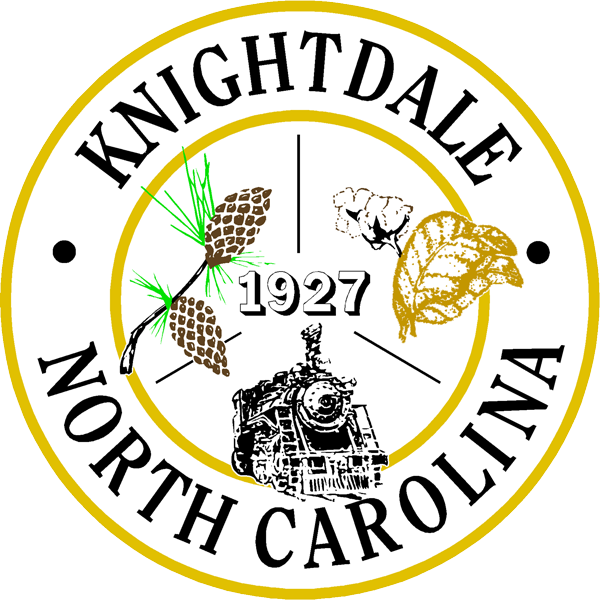
The Town of Knightdale has embraced its generations of residents from the early years of the Town's history, and those generations are represented in the logo through their drive to start something great! This Town has always been a place to start something, dating back to the early 1900's when Henry Knight donated land to the Norfolk and Southern Railroad Company, and in 1904 a railroad was built here in the area. The railroad brought a lot of business to the town and many families moved here to work for the railroad company. They decided to incorporate in 1927 and chose to name it after Mr. Knight for his important role in bringing the railroad, businesses, and people to the town.
That same spirit of support and community lives here in our wonderful town today. You can build something new, a new life, family or business. Whatever it may be, you know you can start something here in Knightdale!
The Storytelling Power of a Simple Logo
Symbolism, style, color schemes, and modern trends are all a critical part of creating a logo, and rebranding requires careful thought and strategizing. That was the task the Council and Mayor took on in 2012. The goal was to magnify the culture that already existed in Knightdale and build on that theme in a more modern design.
A picture speaks a thousand words, and a logo speaks a million. Those 250×250 pixels tell your town's story to the world. It’s funny how such a small icon can have such a huge impact on how residents, businesses and visitors perceive your town.